|
As you use our system, there may be some ways that we display information
and/or some navigation elements that you have not used online before. This
page is designed to give you a preview of the interface elements that we use
to provide online services.
NOTE: The display and function of some data elements are browser-dependent.
Popular, preferred browsers should experience
little or no problem displaying and supporting the various elements we use on
our site.
Fields that allow for data entry are clearly visible to the user, while
fields that do not allow data entry or modification of existing data are
‘grayed out.’ Required fields are usually marked with an asterisk (*).
Action buttons that the user has the option of selecting are clearly visible
to the user, while the action buttons that are inactive and not available to
the user are ‘grayed out’ (i.e. the ‘Approve’ button below). Some buttons may
be inactive due to their inapplicability, such as a transaction that has
already been approved. Others are not available to some users based on user
rights or entitlements.

Our online services are optimized to provide a large amount of data in a
small area to prevent the need for the user to scroll unnecessarily. If you
see a panel with a title like the one below, you can open and close the panel
to reveal additional data or options.

Double-clicking anywhere on the panel, or single-clicking on the double-square
symbol on the right side of the panel will expand the panel as displayed
below.
When data is displayed to you in a table, the columns can generally be sorted
in ascending or descending order by clicking on the column header (the title
of the column). Click the title once to sort ascending, and again to reverse
the sort order.
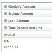
Sometimes data can be grouped into categories and will be displayed as such.
If you see plus or minus next to a label, the data in the group can be
expanded or collapsed for that group. In the example below, there are seven
posted transactions for an account that are revealed when the user clicks on
the “+” to the left of the label. The “+” then turns to a minus to indicate that
the group can be collapsed.
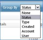
When you see grouped data, you will generally have the ability to group based
on your preference via the ‘Group By’ selection on the page. The image below
shows group options for secure messages.
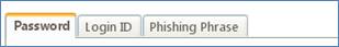
Some pages have several options on a single menu. In those cases, we
sometimes use a tabbed display to limit the need to scroll on the page and
make your options clearer. Just select a tab, complete the required
information, and click ‘Submit’ as you would on other pages.
When we require you to follow a step-by-step process, such as registering
your computer or resetting a forgotten password, you may see a Progress
Indicator like the one below. The checkmarks indicate that you have completed
to step, while the bold box indicates the current step in the process.

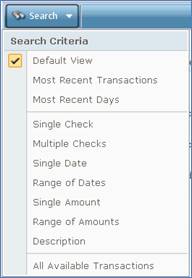
Searching for Specific Data
Some pages with larger amounts of data also give you the ability to search
for specific data, including Accounts>Online Activity and
Accounts>History. Just pick your ‘Search’ criteria and click the ‘Search’
button.
|